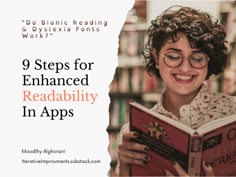
🦾 Does Bionic Reading work?
And 9 Steps for Better Readability in apps

Fans say it unlocks 100% of your brain for reading comprehension, but does Bionic Reading actually work? Plus, 9 research validated steps for better readability in digital products.
What is bionic reading?
Bionic reading was invented in Switzerland - the land that gave us Helvetica - by the designer Renato Casutt.
Its website describes it as:
" a reading system that supports the reading flow. The eye is guided through the text by means of typographic highlights. With the interplay of "Fixation", "Saccade" and "Opacity" visual stimuli can be transferred to the text, which decisively change the typeface."
That sounds pretty authoritative. The research they cite behind bionic reading is reading the papers of Just and Carpenter in 1980, and L.E. Javal. The Physiology of Reading and Writing, from the year 1900.
Bionic reading has its own suite of web and mobile apps and browser extensions. The font is also included in various apps like Reeder RSS and Teleprompter as a font option.
Why Enhanced Readability Matters
It delivers value on a budget. Readability is crucial for users to get the value of text-based digital products where multimedia content hasn’t yet been commissioned. Like, in that first alpha release. Anything from recipe planners, to do lists, or any of the adult learning platforms: if you can’t fully absorb the text displayed on the screen, you won’t see the value of using it. I would hate for anyone’s alpha release to not get the traction it deserves.
It increases your user base: on bionic reading’s website, they claim that 15% of the population have dyslexia. But many other factors other than dyslexia affect reading: astigmatism, age, reading in a second language as an immigrant, being chronically ill, and being on medications that impact cognitive function. These are all tiny slices of a population, but added together, those numbers count. Making your app available to as many people as possible is always desirable.
Increased engagement: Clear and legible text encourages users to spend more time on a website and engage with its content. When information is presented in a visually appealing and easily digestible manner, users are more likely to read, share, and interact with the content, leading to higher engagement and improved conversion rates. Remember the early days of Medium? Clarity and readability over the customised hellscape of personal blogs made it so much more sharable online.
Right now, it feels like including fonts like bionic reading and Open Dyslexic or dyslexie font are the default steps to check off the box “making the app accessible”.
Making sure this step has the impact we hope it does, matters.
Does Bionic Reading Work?
A 2000-participant, timed reading session doesn't think so.
"In fact, participants read 2.6 words per minute slower on average with Bionic Reading than without. That said, the difference here is so small (less than 1%), that the real takeaway is Bionic Reading has no impact on reading speed."
Playing devil's advocate, it's possible that the font is only helpful to people with dyslexia, in which case a generalised survey would give mixed results.
Except, a similar result is found for dyslexia-specific fonts like Dyslexie for students with dyslexia. There is only the tiniest increase in word reading fluency, but for letter reading speed and memory, the results are not clear in comparison to Times New Roman and Arial.
Which is almost to the letter what the bionic reading study showed.
Should we stop including dyslexia fonts and bionic reading as options?
The non-profit Understood feels there is value in including such font options. for people with learning differences:
Dyslexia fonts use thicker lines in parts of letters. The letters are slanted a bit. And letters that have sticks and tails (b, d, and p) vary in length. Some people with dyslexia like this and find it helpful. People without dyslexia might like those features, too.
The same can be true for the bionic reading font.
Conclusion on Specialised Fonts
The key takeaway is that merely including these fonts won't be enough to ensure accessibility; further efforts are required.
What UX can I implement for Dyslexia or Enhanced Readability?
Fortunately, an absolutely stellar article already exists called "Designing for users with dyslexia" on Medium by Camryn Manker
It’s worth the 7-minute read, but here are SOME of her recommendations:
Allow users to choose their own font.
Allow for unconventional colour and background colour combinations. Dark blue on cream works well, and it seems many people with dyslexia prefer warm backgrounds.*
Some people with dyslexia actually find comic sans more readable on the above colour theme.
Add media like video or audio to allow people to absorb the content in the format that works best for them.
In addition, you can also look at apps like Kindle for features they’ve included for increased readability:
Allow people to choose margin and column width. Narrower margins and fewer words tend to help people with reading.
And then the regular advice given for skim-ability matters a lot. Skimability is also the steps you would normally implement for good SEO.
UX for Skimability
Aim for around 50-75 characters per line
Use a lede or summary at the front of the article and a summary at the end. Here’s a nice example.

.
Use a table of content for longer text.
Use icons to help recognise different sections. Here’s an example from Ali Abdaal’s newsletter. All the sections have an emoji to help the eye skim along.

Remember, these tips help everyone read and absorb your content better, whether it's due to dyslexia, Vision problems, brain fog from poor health, age, or reading in a second language.